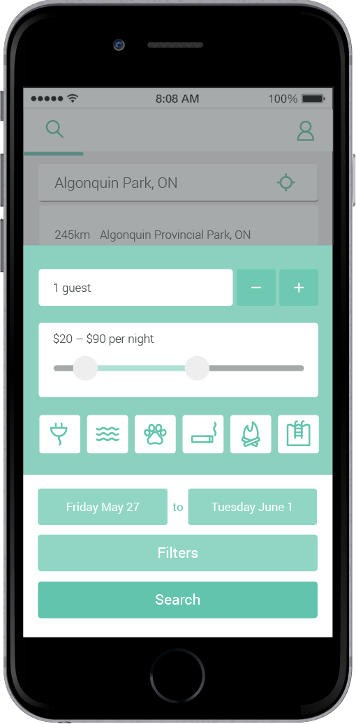
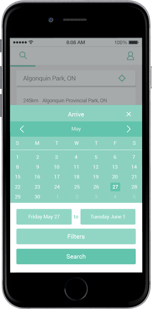
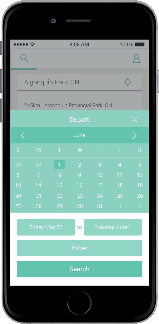
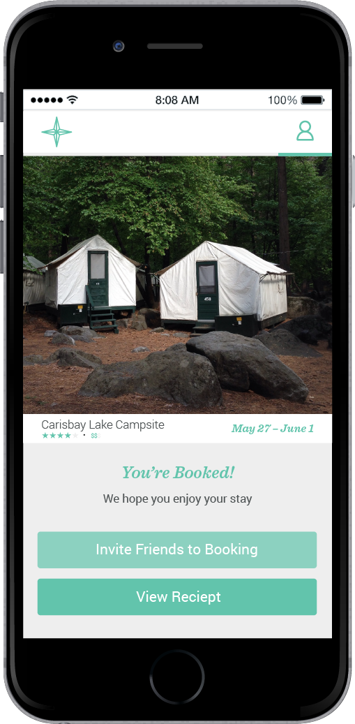
Prior to prototyping, an analysis was undertaken to investigate the people that might use the app, their desired activities within the app, the context in which they would use it, and the capabilities of current technology to facilitate their needs. User scenarios and flows were also generated; this process work can be seen below.
This project was completed with Francesca Morreale and Evelyn Quinn and received an Honourable Mention in the User Experience category for the RGD’s 2016 Student Awards. My roles included drafting the user scenarios, designing the user experience, creating both the low-fidelity and high-fidelity prototypes (using Prototyping on Paper and Pixate [RIP], respectively), refining the high-fidelity interface, and directing, shooting and editing the promotional video.
—Target Audience
The target audience is people looking for an easy and informative way to find and book a campsite; aged 18 to 55, any gender, any occupation, any level of education; interested in nature, camping, hiking, and exploring outdoors.
—P.A.C.T. Analysis
P.A.C.T. stands for “People undertaking Activities in Contexts using Technologies.” An analysis of the idea for our application provided the following focused considerations:
People
- families
- young couples
- groups of friends
- individuals
- hikers
- adventurists
- organizational groups
Activities
- finding campgrounds
- sorting by location, cost, size
- looking at campsite amenities
- comparing prices
- communicating with campgrounds
- booking campsites
Contexts
- physical environment: home/office setting, researching
- social environment: planning with friends/family members
- organizational context: self-guided content, comparing
- circumstances: leisurely but convenient, vacation planning
- giving users new knowledge, what campgrounds offer
Technologies
- smartphone: screen-based, mobile, location services, phone, email, social media
- input: location of site, budget, number of people, desired amenities (text and interface)
- output: campground options and details, comparison of locations
—User Scenarios
The following scenarios were generated to help plot pathways a user might take to achieve a variety of goals:
Imran
- A 55-year-old man with many years of camping experience wishes to take a solo kayak trip for two days to a provincial park within a 3-hour drive of his house
- He will use a small tent by himself, will need to park his truck on his campsite, and will need to be close to a lake/river/appropriate kayak route
- His requirements are a moderately sized campsite with a fire pit, access to outdoor toilets and water
- He is moderately comfortable with technology
Tanya and Krisha
- A couple in their early 30s with moderate camping experience wants to take a week-long vacation to an out-of-province campground that they have never been to
- They plan to fly and then rent a car and a medium-sized tent trailer for the week
- They want a site that has trailer hookups for electricity and water
- They want a campground that has a reputable beach, hiking trails, sells firewood and rents bicycles, and is near a town with a grocery store
—User Flow
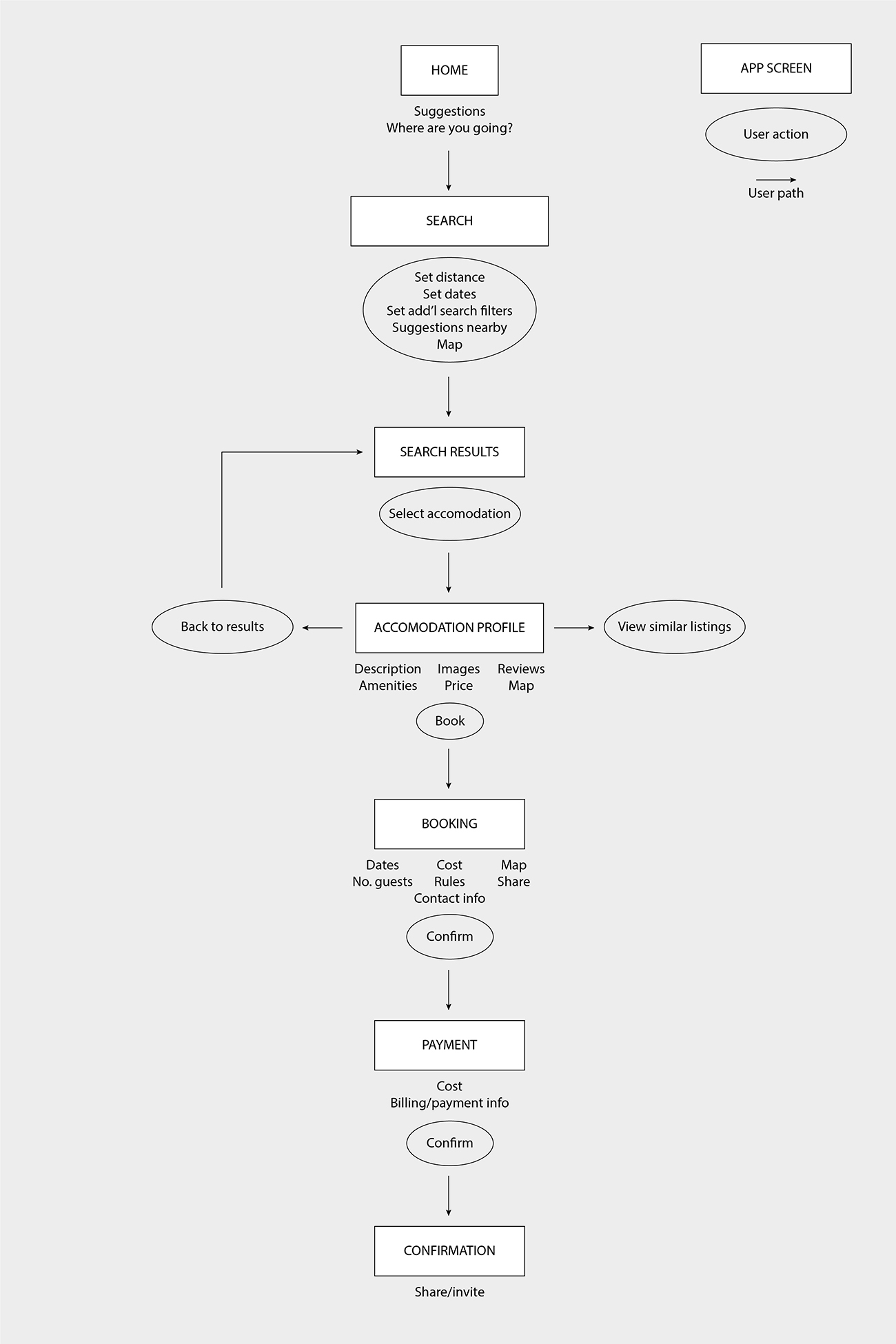
The path a user takes through the app is detailed below. Click the image to view full size.
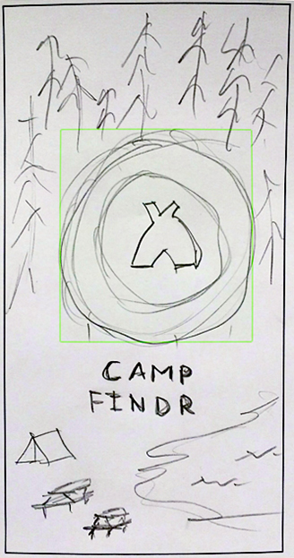
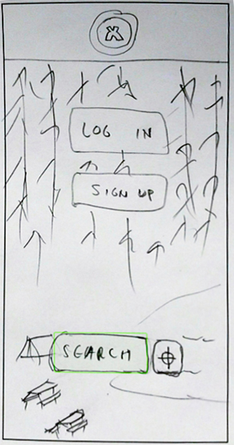
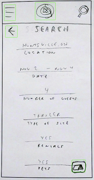
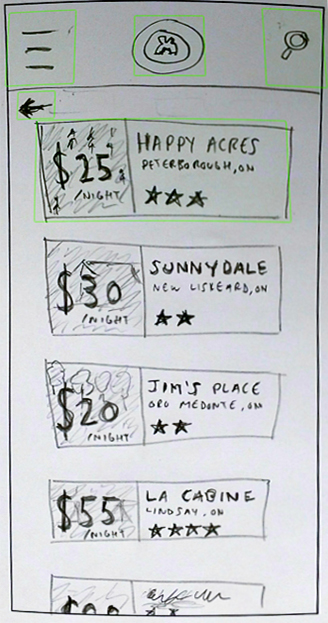
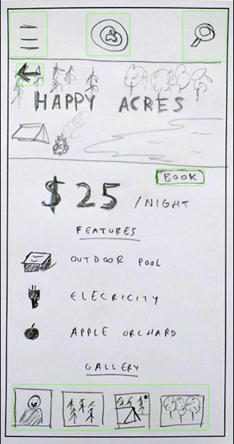
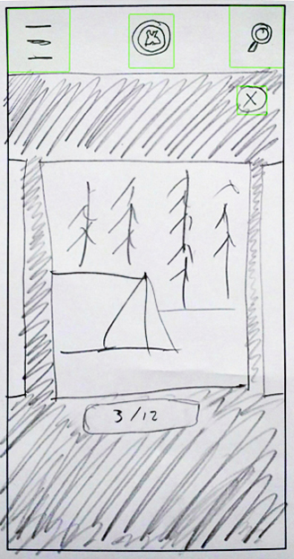
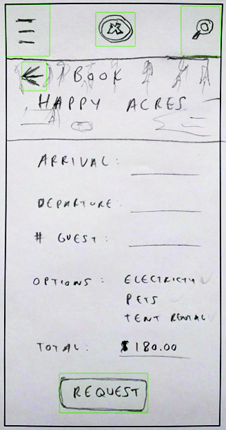
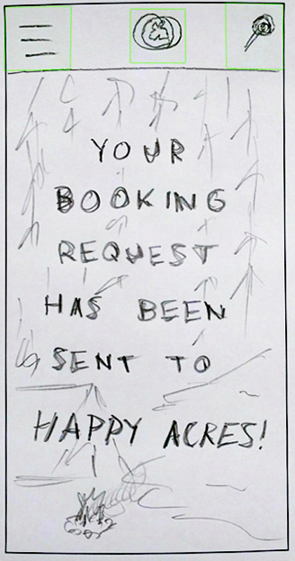
—Initial Sketches
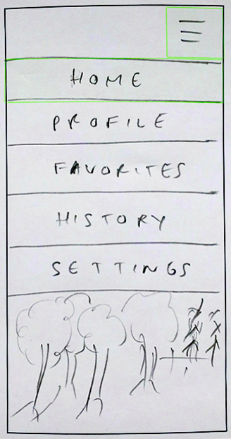
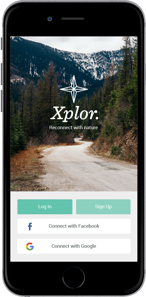
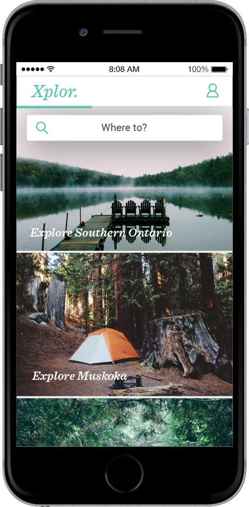
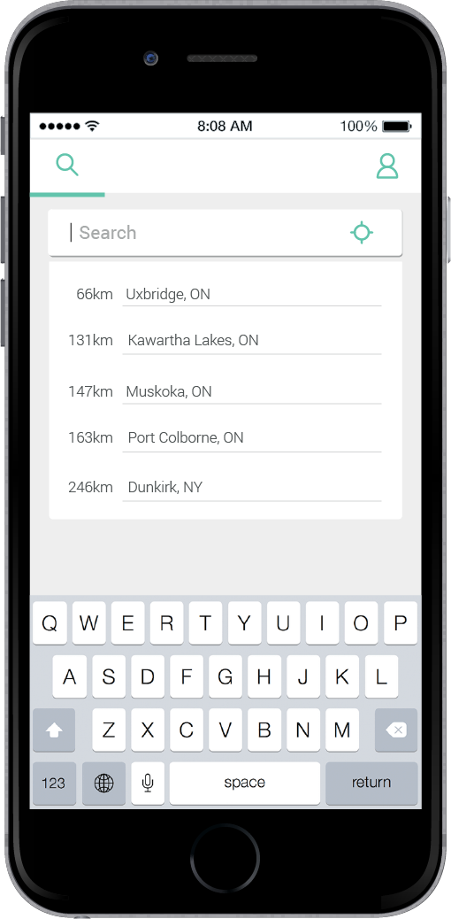
This was the first visualization of the app (before the name changed). These sketches were used to make a rapid prototype with Prototyping on Paper to test usability.
